Wednesday, July 30, 2008
Splitcoast Sketch Challenge
Tuesday, July 8, 2008
Tuesday Jacksonbelle Challenge
Lynda Benden
Amber Hight
Beth Thomas
Broni Holcombe
Dee Jackson
Elizebeth Neumann
Erin McKinney
Lila Holgate
Maren Benedict
Tuesday, June 10, 2008
Tuesday Jacksonbelle Challenge
The Sketch Challenge.

Now for the Jacksonbelle challenge! Lynda created a sketch this week! Be sure to play along and use JB006 as your keyword if you upload it to Splitcoast. If you blog it, give us a link so we can see it! Do play along - even if it isn't today....play tomorrow! I actually made the card last week while I was in the green/brown/orange mood! This week I will try some new colors! I used Prima Urban Cosmos papers, which comes with the awesome ribbon and flowers! I just love this Inkadinkado stamp (the main big oval frame), but then I added a few TAC stamps, "Life is too short....to sit when you'd rather dance." I love this set from TAC - Life is Short...it has great sayings! I also used Nestabilities, Prismacolor pencils, a little bling and Lots'a Brads! Thanks for checking me out.....and do try to play today!
Be sure to check these out too!
Wednesday, June 4, 2008
Wednesday Sketch Day!
Wednesdays just aren't the same without them (and neither are Tuesday nights as that is when I usually make the card). You will find the sketch here: SC179. Rox71 really picked a great one this time, and I had a lot of fun with it!
The Card.
You are probably sick of it by now, but I used Brown, Green and Orange again, but I threw in a little bit of Pink this time to spice it up!! If you haven't tried Prima's new paper....you are missin' out! I used Prima Urban Cosmos and I think it is gorgeous....every single piece of paper in the whole pack is gorgeous (and it comes with extra goodies too!) I decided to keep the base of the card pretty simple. I Cuttlebugged the already-polka-dotted paper with Swiss Dots and since I didn't want white dots (what Swiss dots will do to patterned paper) I ran some Versamagic Spanish Olive gently over the top and it was a perfect match! I LOVE this ink! I then used the Fiskars Treading Water (scalloped edge) punch to create the Choc. Chip pieces under the ribbon. I used an extra piece of Choc. Chip to cover up the holes as I only wanted the scalloped edge to show, no holes. The ribbon is May Arts Double-Sided Satin and it is gorgeous! This is the same ribbon as I used yesterday on the motorcycle card...I just used the reverse side. I wanted the focus to be on the image so I dressed it up a bit. I used the Inkadinkado Fancy That butterfly. Stamped it, colored it, cut it out, and then popped up the butterfly. I used some old retired SU! wire to create the antenna, then I used a few tiny Prima flowers and some bling to finish it off! I layered it on a couple of punched scallops, and I used my new hole-punch shape guide thingy (a prize from Jennifer Greco's Blog, Thank you ever so much) and it worked perfectly....I think I am going to be using these often! Well, I guess that about sums up the card! Thanks for looking!Monday, May 26, 2008
Tuesday Jacksonbelle Challenge
Open View.
I've had the sketch Lynda created printed out for several days now, and as soon as I printed it out I knew what paper I wanted to use and what stamp set....I even made notes on my printout...can you believe that? I almost can't! I've never done that before! I was supposed to be working and I kept looking at the sketch and I kept "seeing" things I wanted to do for the card! I am quite proud that I really stuck with the sketch! I did, however, make it a gate-fold card..I'm not sure if that was what Lynda planned (I haven't seen hers yet) but that is just what I saw! I'm normally not very comfortable working with bright colors but I LOVE these colors! I think it would make a perfect boy card (something else I'm not all that comfortable with even though I have two boys!). I had LOTS'A fun with this one! I LOVE the sketch Lynda! Thank you soo much! Card Details: Prima Marketing The Dude Collection (LOVE THIS PAPER!), Lizzie Anne Designs Out Of This World. SU! Cool Caribbean, Pumpkin, and Black.
Don't forget to check out the others!
Broni
Beth
Amber
Maren
Erin
Lila
Lynda
Thanks for stopping by!
Wednesday, May 14, 2008
Wednesday Sketch Day!
I decided to use my new pack of Crate Paper, Static. When I purchased this paper I thought the colors were wonderful but I wasn't too sure about the style, but once I felt the paper and saw it in person...I LOVED it! I'm not really a rocker per se but I do like rock music, and I'm not a surfer, but I do live on the coast...so it works for me! The papers are gorgeous actually, and if you don't like the skulls and bikes on one side, the back of the paper is gorgeous too! The paper pack is huge and comes with rub-ons ("Rock Star" and the brown swirls) and a sheet of die-cut pieces (the guitar and the stars). There is no stamping on this card, but I did use Versamagic Jumbo Java to distress the edges a bit. I used Crystal Effects to on the guitar and stars to give them a bit of shine! All in all, Great paper and a Fun sketch!Wednesday, May 7, 2008
Wednesday Sketch Day!
The card.

I wasn't too sure how much I was going to like the sketch just by looking at it...it seemed like quite the challenge for me, but it came together quite quickly actually and I like the end result! Simple yet eye catching! It was really late (1:30 a.m. ) and I decided I needed to keep it simple, so I stuck to the sketch and the only fancy work I did was making the stamped image a bit two-toned and then I added a row of dots around the right half-circle, and I also added some stickles to the butterflies to give it a little dimension, but I don't think that shows up in the picture. That was it! The paper.....OH how I love the paper! It is a recent find for me in a clearance stack at a scrapbook store, so I'm assuming it is old news..but new to me. Anyway, it is called Daisy Bucket...it is delicioso! It is quite thin but has some yummy texture and takes ink well. I used it on another card, but I will show that one tomorrow! Cardstock is Choc. Chip, and perhaps More Mustard, but I didn't think that I owned that color - maybe that rust color, but for sure not Pumpkin, Marigold, or Apricot (I found it in my scrap box). I'm terrible with the SU colors that I don't use often, lots of the purples, blues, and greens, I just don't know. It is a bit orange, but a bit dirty looking, all I know is that it matched the DP good enough...and it was close to the right size, so I used it! The beautiful butterflies are from Inkadinkado Patterned Bugs. (Jacksonbelle has one left in stock!) I am so happy with this stamp set....I reach for it often! Ooh, and I used Versamagic inks for the butterflies. I think this ink works beautifuly for clear stamps and is my first choice if I have the color! (Note to self...get more Versamagic colors!) I was actually shocked that I had the right colors for this card!
Wednesday, April 30, 2008
Double Duty
The Tall Card.

I thought I'd be tricky and call today's post double duty cuz I pulled off two Splitcoast Challenges, the color challenge and the sketch challenge. First, the colors....they are yummerific! Basic Black, Soft Sky, and Purely Pomegranate, CC164. Second, the sketch.....at first it appears to be a nice and easy normal sketch......but really it is a tricky one!! It is a simple layout on a GIGANTIC card and it was really hard to get a good picture of! The card measures 9-1/4 x 4....and fits in one of the larger business/letter envelopes. Check out the sketch here: SC174 and be sure to search the gallery for other great examples!
I used my Scor-Pal to score the card (the sketch also has a specific fold-line) so this worked well! Then I used my corner-adorner to create the black scalloped edge, pulled out my daughter's handy-dandy Hello Kitty sewing machine (an excellent sewing machine that is super cute!) and zig-zagged the folded portion down so it would stay in place. I even found perfect Pomegranate thread in her thread box so you can imagine how thrilled I was! I decided to go with the bird from Inkadinkado's Bird Assortment (thanks Heather!). I stamped it, ran it through my Big Shot with the oval Nestabilities, colored the legs, then stamped it again on another piece of paper, colored it with Prismacolor markers, and cut it out to do some paper tole. I used a small stamp from Inkadinkado's Flourish Pack, (thanks again Heather...I'm a bit spoiled : ) to create the background stamp on the Soft Sky paper. Then I did one of my most favorite (but often forgotten) necktiques.... I used my white Prismacolor pencil to color in a few parts of the stamped doodle-branch to make it pop just a bit more! I LOVE the white pencil for this. You get a much softer look than a white gel pen, and it is much easier to control! I also used the white pencil to create the dots on the black scalloped edge. I do love the look of a white gel pen, but with the pencil (which is more forgiving than the pen because you can erase most of it) you get a much softer look, and best of all no bubbles or blobs!
A closer look.
Well.....that's all folks! Thanks for stopping by!
Oohh... I did make another card today, but I'm going to save it for tomorrow! I love the way it turned out so don't forget to check tomorrow!
Tuesday, April 29, 2008
Mojo Monday #35 Sketch

About the card: This was a tough sketch for me - way out of my comfort zone! I just received a few new Bellas yesterday so I knew I needed to play with those, but I wasn't too sure how they'd work with the sketch. I may have gone a little overboard with the brads, but I liked that it gave a funky studded-girl feel to go with the TAC Uptown Girl paper. I tried to stay as close to the sketch as possible, and to achieve the "XXXX" part, I used DaisyDs rub-on tape, zigzag. To get the cross-stitch look, I just ran it twice making sure that the second application lined up in-between the first one.
Wednesday, April 23, 2008
SCS Sketch Challenge 173
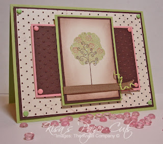
So, about that card! I was thrilled to get the chance to do another sketch challenge. I used to shy away from sketches, but lately they have been quite fun! Today’s sketch challenge is from Splitcoast Stampers, SC173, and I even did the color challenge (CC163), which really wasn’t a challenge for me, as I use this combo often, Chocolate Chip, Certainly Celery, and Pretty in Pink, in fact, I think I used these colors to make these cards!
I decided that with all of the layers, the main image needed to be something simple and cute, of course...so I went with my new mini stamp set from TAC, A Little Spring. I “glitterfied” the tree and curled the scrappers floss (love this look but it doesn’t last forever L). I cuttlebugged the shimmery white background piece, I ran it across my Chocolate Chip ink pad to make the swiss dots stand out a bit more. I thought it needed something a bit more…so I put some matching brads in the corners (these are the only SU! colored brads that I have and lucky me…they matched!) Hmm.. I think I must like these colors!
Well, enjoy….and thanks for stamping-by!
Hmm.. now that I look at the picture, I think probably had I had some Choc. Chip brads, I would have put them on the corners of the main image...(note to self...look for brown brads to buy...where in the heck do you buy those...and does SU! sell them? if not, why the heck not???)
Also try to find something else to make my pictures look purdy...people might be getting sick of the baubles..but I like the baubles...hmm
Wednesday, April 16, 2008
Look Ma! No Pink!

Tuesday, April 15, 2008
Another late Sketch
Now that I've seen the ones uploaded to Poetic Artistry, and I've seen the winners, (and shown you the winners) I almost feel ashamed to post mine....but I loved it (before I saw the others) so I'm showing you anyway! I used the new BG paper, Sugared, and yes, it is sweet and delish! I would normally NEVER use these colors together, the yellow color and pink, but the BG paper made me do it! And I LOVED it! It felt so retro! The paper reminded me of something I'd see my older sister wearing in old pictures, so I picked the owl as my image, because she probably had some sort of owl embroidered somewhere. And now that I think of retro owls, I'm reminded of my mom's old macrame owls on old pieces of scrap myrtle wood! OMG...that is such a funny memory! The link isn't one of my mom's, but just in case you were not subjected to macrame owls... I wanted to give you a visual!
Spanks for stopping by!
Monday, April 14, 2008
I'm Late!

Wednesday, April 2, 2008
Another Sketch Challenge


Thursday, March 27, 2008
All Mixed Up Again!
I used the same stamp set, All Mixed Up, and I’m wondering why they retired it! I think it is soo stinkin cute and I can’t believe I waited a full year to cut it! I used the same layout. The girl is really holding a heart, but I didn’t want her to, so I gave her a bouquet of flowers instead! I wanted her to be radiant, so I lit her up with yellow, then shaded around the yellow with a blue. I can't decide if I really like the effect, but I liked the card well enough to accept it! (I wasn't coloring it again!!)
Ballerina:
PTI White, DCWV blue CS, SU! Purely Pomegranate CS, all patterned paper is from TAC Catelynne Fly With it Paper Collection. Colored with prismacolor pencils and OMS. Flowers are Doodle Bug Cupcake Paper Posies.
The ugly duck below is really "All Mixed Up!" It was so much fun to color his slippers pink and to add the pink brads....way out of my norm....but I love how it turned out! I thought of my youngest son when I made this card! He's on the goofy side and likes to be different, but now that I say that...maybe I was thinking about my eldest....He really likes to stand out in a crowd! Hmm.. Perhaps I need to make another one!
One Ugly Duck!
One Ugly Duck:
PTI White, DCWV Blue/Yellow, patterned paper from retired TAC Designer Collection Country Cottage, Making Memories Polo Shimmer Brads (the pink ones to match the slippers!).
Thanks for stoppin' by!
Wednesday, March 26, 2008
Splitcoast Sketch Challenge
Just a quick post to share my second EVER Splitcoast Stampers sketch challenge! SC169 I normally have such a hard time following a sketch that I never do them! This week was different….there was an additional challenge that actually helped me! The challenge was to make the final layer, #4, only 1-1/2 inches wide before any additional layers! Well this "narrowed" down my options to about 2 stamp sets! I stamped the main image (see hint below) and made sure I could cut it to 1-1/2 inches wide without cutting off any toes…or I guess I should say webs! Then I colored the image. I find that more often than not I color my images before I even pick out paper, cardstock or patterned paper, then I match the paper to the colored image. I found an old stack of Retro DCWV paper and thought that this brown/blue print looked actually pretty good even though the only blue in the colored image was some shading I did…..and then I went to town! I cut and measured and slapped it all together! I distressed the #1 paper, the Chocolate Chip…so much so that I was able to peal the edges apart. I think I like this technique! I sort of still feel like there is an empty spot, but I was hoping that some of the wrinkles would fill that up! Found some yellow brads that I would normally never use and thought it kind of pulled it all together quite nicely! Not my norm…..but I do like it!

Stamp set hint:
I have never used this stamp set before; I think I’ve had it for over a year - yikes - and never cut/mounted it! Usually I am sketch-challenged because I just don’t ever know where to start, what stamp set to use or what paper to use! So only being able to choose from two sets really made it much easier for me! Normally I’d use the Stamp-A-Ma-Jig (which I will call SAMJ) for a two-step stamp set like this, but since I hadn’t mounted it yet and I wanted to use it in a hurry (and I couldn’t find my clear piece for my SAMJ), I figured out a way to mount this set so that I will not need to use the SAMJ! Each little guy in this set comes in three pieces, head, body, and legs. When I mounted the head, I made sure that the neck was right at the bottom edge of the block as close as I could get it without hanging off, and I made sure I cut it really close too. Then the middle section doesn’t really matter, but I did decide to mount the upper portion of the body, the shoulders, towards the top of the block. The last section, the legs, I also mounted towards the top of the block, so that the ends that must meet up with the stomach are as close to the top of the block as possible. I stamped the mid-section first….this is very important! Then I stamped the head; I leaned my head down a bit so I could see just where I was placing the neck and lined it right up with the shoulders of the already-stamped mid-section! Then, and this is another important part, I rotated the stamped image 90 degrees, so the head/midsection were now upside down, then I took the lower section, the legs, turned that stamp upside down and lined up the top of the legs with the bottom of the mid-section and stamped. I got it perfect the first time….without the SAMJ! When I finally get around to mounting the rest of the set, I do plan on mounting it this way! I’m a bit bummed that this set retired! I think I’m going to love it….even though I am a year late!
I woke up this morning to icky thunder and lightening and the kids asking if they really had to rake the yard today! I said, “Why of course you do! Get out there with your metal rakes and get working!” Is Spring Break over yet?
Thanks for coming!